A visual brand identity is all about how your business looks and feels on social media.
On Instagram, a strong visual identity can help strengthen your brand message, make you look more professional, and even convert visitors to your profile into lifelong followers.
And the good news is, you don’t need to break the bank to do it.
You can improve your visual branding on Instagram for free with the help of a few online tools. Here’s how:
Table of Contents
What is a Visual Brand Identity and Why is it Important?
Many brands struggle to get to grips with having a visual brand identity, but it all comes down to how your business looks and feels with every social post you share.
Having a strong visual brand identity can give an instant impression of your brand’s personality and values, without saying a single word.
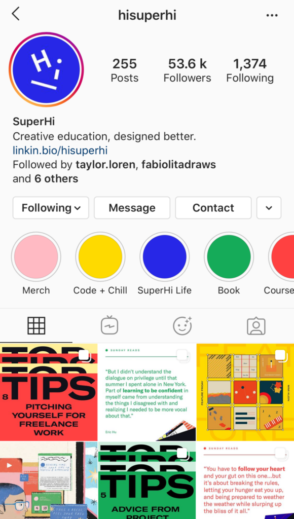
It’s an opportunity to share your brand’s story: Fun and lively? Clean and minimalist? Youthful and rebellious?
The colors, fonts, and imagery you use can paint a picture in seconds.
On a crowded and competitive platform like Instagram, the strength of your visual branding can make or break whether someone follows your profile and engages with your brand.
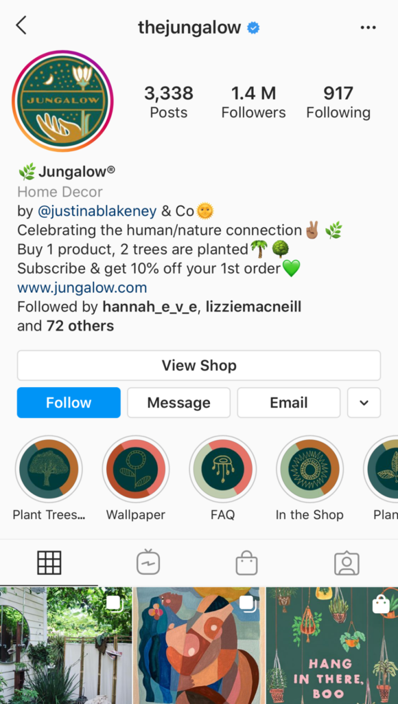
And you don’t need to be a world-class designer to get started!
This step-by-step guide covers all of the elements you’ll need to build a strong visual brand identity on Instagram:
How to Create a Visual Brand Identity Step #1: Define Your Brand Values
The first step in almost every design project is to define what you want to say, and who you want to say it to.
This is especially true when it comes to branding.
The more you understand your brand values, the easier it will be to create a strong visual identity that supports your brand’s mission.
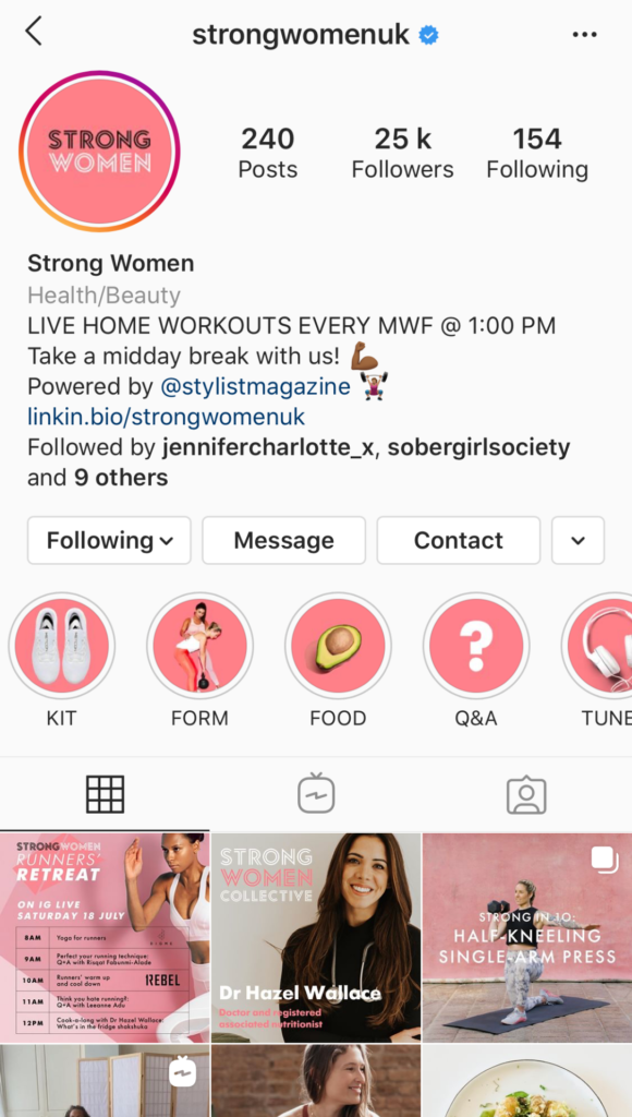
If you don’t have your brand values nailed down just yet, jot down a list of adjectives for your brand and highlight the ones you feel are the most important to convey to an audience.
And if you’re still drawing a blank, ask yourself what city or type of car your brand would be — and don’t be afraid to get specific. This can often help visualize your brand’s personality more clearly, especially when you question why you feel a certain association.
For example, a bright green campervan has very different attributes to a red racing car. There’s no right or wrong answers here, the real value is understanding what inspired your choice.
If you’re feeling extra creative, you can also create a brand mood board at this stage. The types of images, colors, textures, and fonts you choose should help clarify your vision, and give a better idea of how it translates into visual communications.
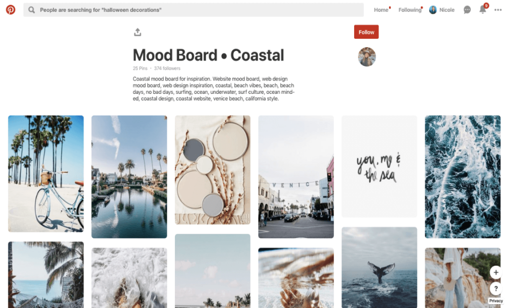
There are a ton of different programs and apps that you can use to create mood boards for your brand, from Pinterest to InVision.
Once you’ve found the perfect images for your brand, you save them to your Media Library for future use!
You can map out how these mood board images could integrate into your Instagram feed with Later’s Visual Planner, and schedule them to be published at a later date.
So while you’re honing in on your branding, you’re also planning your future Instagram content — it’s a win-win!
Already using Later? Sign in and start browsing content now. Or sign up today to start planning, scheduling, and posting to Instagram!
How to Create a Visual Brand Identity Step #2: Create Personas to Bring Your Target Audience to Life
The next part of your visual branding process is to define your target audience — so you have a clear idea of who you want to resonate with on Instagram.
And the more detailed you can be here, the better.
For example, if you know your target audience is millennial females, you could also ask yourself what type of music they listen to, what brands they buy from, what they do on a weekend, and what social causes they care about.
By building audience personas in this way, you’ll find it much easier to design branding that speaks to them on a personal level.
You might even have several target audience personas for your brand, each with their own unique set of characteristics.
Once you’ve defined your brand values and created your audience persona(s), you should keep them top of mind as you carry out the design process.
As you complete each step, ask yourself 2 questions:
Does this reflect my brand values?
Would my target audience personas like this?
How to Create a Visual Brand Identity Step #3: Pick Your Brand Colors
Now the real fun can begin!
There are infinite possibilities when it comes to the color combinations you can choose for your brand, each with its own unique set of connotations.
Even different shades of the same color can have a wildly different impact. For example, a soft pastel blue can be perceived as calming or youthful, while a rich navy blue is often associated with regality, stability, and authoritativeness.
Even professional designers can spend hours contemplating colors, their association, and how they can be paired together to create a unique impression — so don’t be alarmed if this step takes you a hot minute to get right.
The good news is that there are a ton of helpful resources available to point you in the right direction.
Colours.Cafe is an Instagram account that solely posts color palette inspiration, with each color code listed to help make the design process even easier:
PANTONE is arguably the leading color authority in the world and offers custom color consulting services. Even their Instagram feed can be a valuable source of inspiration:
Alternatively, you can draw color inspiration from the images you picked out in Step #1, travel snapshots, or even screenshots of Instagram feeds that resonate with your brand — there’s inspiration everywhere!
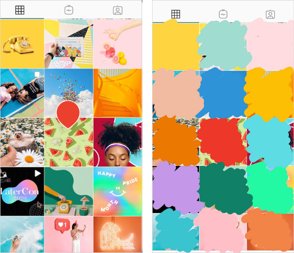
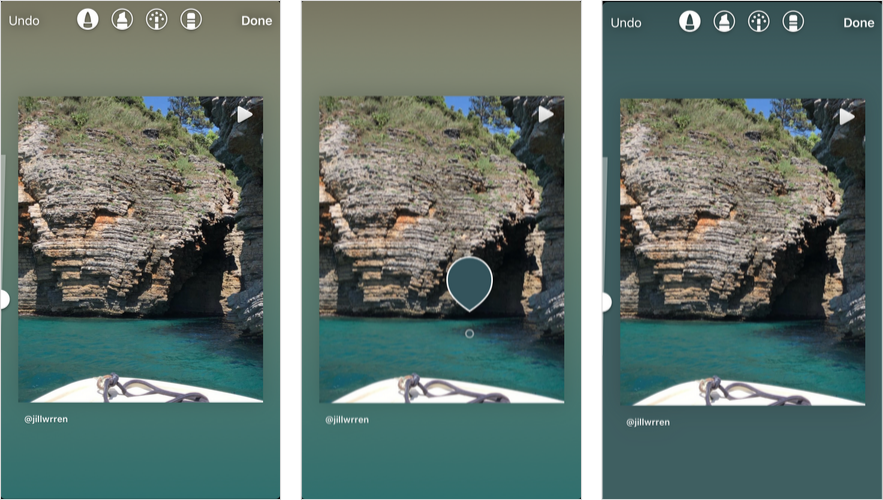
TIP: Use the color select tool in Instagram Stories to quickly pick out a specific color from an image in an Instagram feed and create a swatch (see above). You can then save this swatch to your camera roll and open it in a design app like Over or Adobe Photoshop to discover the exact color codes.
Want to learn more about the complex world of color theory? We teamed up with Matt Riley, Head of Brand at Over, to create a quick guide to finding your brand voice through design:
How to Create a Visual Brand Identity Step #4: Find the Perfect Font for Your Brand
Much like your color palette, the fonts you use on Instagram tell an instant story — so it’s worthwhile taking the time to find the right one for your brand.
There are lots of different categories of fonts, but on the most basic level they can be split into 4 main types:
Serif
Sans serif
Modern
Display
If you’re not sure where to start, it’s a good idea to look at what type of brands typically adopt each font grouping.
According to Matt from Over, serif fonts tend to represent tradition, respectability, and discernment. See how Harper’s BAZAAR uses their serif fonts across their Instagram profile:
Sans serif fonts, on the other hand, signal modernity, objectivity, and even innovation. Many social media channels like LinkedIn and Facebook have opted for sans serif fonts. It’s Later’s font preference too:
Modern fonts are usually perceived as strong and stylish, which is why they’re a great choice for progressive brands like Hulu:
While display fonts are often seen as friendly, expressive, and amusing. Disney’s iconic and playful font is a great example:
There’s no denying that fonts are complex, and with so many different options out there, choosing the perfect one for your brand can feel like a huge undertaking.
Thankfully, there’s plenty of resources to hand. Design apps such as Over and Canva both have extensive libraries of premade templates with ready-made font pairings, while Instagram accounts such as welovebranding can be a great source of inspiration.
TIP: Always test a font’s legibility on mobile before you go live. Intricate or fine fonts can often become difficult to decipher when they’re scaled down to a profile picture or an Instagram Stories Highlights cover.
**How to Create a Visual Brand Identity Step #5: Curate Your Instagram Feed Aesthetic
**
Once you got your colors and fonts covered, you can start curating your Instagram aesthetic to enhance your visual branding.
Your top 9-12 Instagram posts are often the first pieces of content that visitors to your profile will lay eyes on.
From the type of imagery you choose to the filters and editing techniques you apply, every tiny detail builds a stronger story for your audience to follow.
For example, The White Company favors clean, soothing, neutral imagery in their feed, supporting their minimal brand values and target audience:

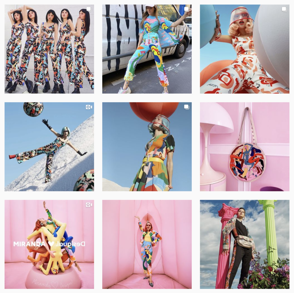
In comparison, Desigual uses bright clashes of color throughout their posts, reflecting their youthful, expressive, and rebellious ethos:
One of the best ways to develop your feed aesthetic is by using a free visual planning tool to experiment with different image styles and compositions.
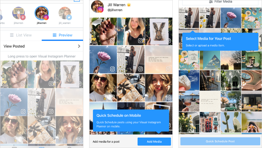
Later’s Visual Instagram Planner shows you exactly what your Instagram feed will look like with your future posts in it, so you can achieve the perfect grid.
You can easily rearrange or swap out photos from your media library until you’ve found the best composition for your feed.
Plus, you can now use Later’s visual planner straight from your mobile! All you need is to open the Later app, select Preview, and Add Media:
Ready to create the perfect Instagram aesthetic for your brand? Design, curate, and plan your feed with Later!
How to Create a Visual Brand Identity Step #6: Create an Application Style Guide
Now you have all your main design elements in place, it’s time to set the rules on how they should be applied.
For example, you might always want certain colors to be paired together, or never want a specific font to be used in conjunction with another.
This is what designers call a style guide — and it pretty much does exactly what it says on the tin. It is a go-to reference for all design decisions, including your brand color palette, fonts, logo, photography style, and application notes.
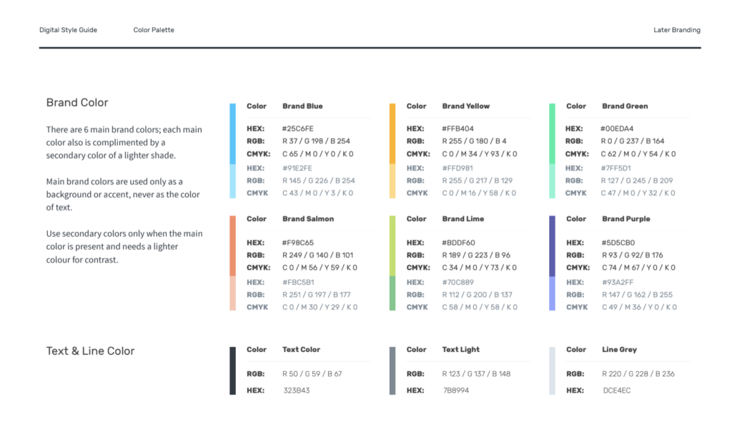
Excerpt from Later’s Style Guide
Your style guide can take whatever form you see fit, although they often include visual slides with several mockup examples. This can really help bring your visual branding to life, showing how your design choices work in practice.
How to Create a Visual Brand Identity Step #7: Apply Your New Visual Branding to Instagram!
Last but not least, it’s time to put all of your efforts into practice on your Instagram account!
Your profile picture, Instagram Stories Highlights covers, and top 9-12 feed posts are all key visual opportunities on your account, so it’s worth focusing on updating these first.
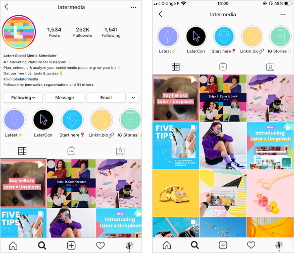
Remember, your goal here is to paint an instant picture of your brand’s values, tone, and style.
You can even share a multiple post grid takeover to kickstart your new visual identity, like The Styled Affair did here to launch their updated branding:

At this point, it’s a good idea to create a folder in your phone’s camera roll called “brand palette.” Here you can save all your design assets, like your brand logo, colors, and any icons or images, that you can use to build visual identity on Instagram.
This folder comes in particularly useful when you want to level-up your Instagram Stories designs. In just a couple of taps, you can copy and paste in your logos or any mood board images you want to color-match your stories to.
TIP: Copy and paste an image from your “brand palette” folder into the Instagram Stories editor and you’ll be able to use the color select tool to find the exact color match.
With your Instagram feed, stories and Instagram Stories Highlights all branded cohesively on your profile, you’ll soon start to see your follower and engagement count rise as people start to recognize your brand.
And that’s it, you’re now ready to take your visual branding to the next level.
New visitors to your profile are much more likely to convert into followers when they get a strong first impression of what your brand is all about — so there’s never been a better time to improve your visuals on Instagram!
Ready to get started? Level-up your Instagram strategy with Later — plan, schedule and automatically post to your feed, for free!
Like This Post? Pin It! ????
